
 Selecting the right blue & greenblue bathroom vanity is no longer just a design choice; it’s a critical decision that directly impacts project profitability and a property’s final market value. While the all-white bathroom was a predictable, low-risk specification for years, shifting client demand for bold palettes introduces new variables. A poorly executed color scheme can lead to costly rework, client dissatisfaction, or a finished space that hurts a home’s appraisal.
This guide provides a technical framework for specifying these saturated colors with confidence. We move beyond simple trends to detail the operational side of the process. Inside, you will find a clear analysis of pairing gold versus matte black hardware, instructions for identifying and preventing paint defects like \\”orange peel,\\” and a repeatable system for matching tile to ensure a cohesive and high-value result.
Is the All-White Bathroom Dead?
The all-white bathroom isn’t gone; it has evolved, replacing sterile, cool palettes with warm whites and natural textures to create a more sophisticated, spa-like environment.
The Shift to Warm Whites
In 2026, the market has moved past the clinical, cool whites that once defined minimalist design. The new standard favors warmer, more inviting tones to make the space feel clean without feeling sterile. This evolution is a direct response to a demand for bathrooms that function as comfortable, spa-like retreats. The goal is no longer just brightness, but a balanced, nature-inspired atmosphere.
- Warm whites, such as Pantone’s Cloud Dancer, are seeing increased adoption for their ability to soften a room’s feel.
- This shift moves away from a purely minimalist philosophy and toward a more balanced, organic design.
Adding Texture and Natural Materials
To avoid a flat, one-dimensional look, the modern white bathroom relies on layered textures and organic elements. This approach adds critical visual depth and a sense of refined durability. Designers are mixing materials like wood, stone, and varied tile finishes (matte, glossy) to add character and warmth. The objective is to merge timeless simplicity with contemporary comfort, turning the bathroom into a functional personal retreat rather than just a utility space.
Why Is Navy Blue Timeless?
Navy blue’s endurance isn’t a trend; it’s rooted in its psychological association with stability and its unmatched versatility as a foundational design color.
Certain colors fade with seasonal trends, but navy blue maintains its relevance. Its lasting appeal is directly tied to its psychological impact, where it consistently evokes feelings of trust, calm, and professionalism. These are qualities valued across cultures and industries, making navy a reliable and safe choice for long-term design projects, from corporate branding to residential interiors.
A Symbol of Trust and Stability
Navy blue has a deep, sophisticated aesthetic that promotes a sense of order and reliability. It’s a color that doesn’t demand attention loudly but earns it through a quiet confidence. This has established it as a foundational color in professional environments where conveying authority and stability is critical. It feels secure, grounded, and dependable, which is why it’s so frequently used in uniforms, financial branding, and high-stakes settings.
- It conveys authority without aggression, making it a go-to for corporate and professional spaces.
- The color’s depth creates a feeling of structure and dependability in any design.
Versatility in Application
Beyond its psychological weight, navy blue is extremely adaptable. It moves seamlessly between formal and casual settings without ever looking out of place. This functional range ensures it remains relevant whether it’s used on a luxury bathroom vanity or in everyday fashion. It acts as a powerful neutral, pairing well with a huge spectrum of other colors and materials, from warm brass metals to crisp white marble.
- It works as a strong base color, complementing everything from bright accents to muted, earthy tones.
- Its ability to fit into both modern, minimalist styles and traditional, classic designs guarantees its long-term value.
Capture Your Market with Custom Vanities
Why Are Dark Greens Trending?
Dark green vanities are gaining market share in 2026 because they directly meet consumer demand for nature-inspired, wellness-focused bathroom environments, replacing the cold minimalism of previous years.

A Connection to Nature and Wellness
In 2026, the demand for dark green stems from a fundamental shift in how people view their bathrooms. These spaces are no longer just functional; they are personal wellness sanctuaries. Homeowners are actively moving away from sterile, clinical designs and seeking grounded aesthetics that promote psychological calm. Dark green directly answers this need by transforming the bathroom into a serene, nature-inspired retreat.
- Deep forest and moss tones create a tranquil, spa-like atmosphere that feels restorative.
- The color brings a sense of the outdoors inside, which fosters a feeling of stability and calm.
- This trend is part of a broader industry pivot from stark minimalism to organic, comforting interiors.
Sophisticated Design Versatility
Dark green offers exceptional versatility for creating specific moods. It pairs naturally with warm materials like brass hardware, wood accents, and natural stone, producing a cohesive and luxurious feel. At the same time, it can anchor a dramatic, confident look when set against high-contrast black fixtures and graphic flooring. This flexibility makes it a powerful tool for designers and a safe bet for property developers.
- It complements popular warm metallics and natural textures, ensuring a high-end, integrated appearance.
- The color adapts easily to different styles, from soft and elegant to bold and modern.
- It provides a timeless visual impact that ages gracefully, solidifying its position as a classic design choice.
Reflecting 2026’s Earth-Tone Palette
The rise of dark green is not an isolated event. It is a key component of the larger color palette shift for 2026. The market has made a definitive move away from the cool grays and stark whites that dominated the last decade. Instead, design trends now favor warmer, earth-toned hues that feel more substantial and inviting.
- Dark green aligns perfectly with the interior design movement toward warm neutrals and earth tones.
- It serves as a rich, sophisticated alternative to the overused cool tones of the past.
- It echoes the natural finishes of dark and medium wood tones—another key trend in luxury bathrooms.
Why Is Sage Green the “Spa” Choice?
Sage green’s muted, nearly neutral tone minimizes visual stimulation and evokes a sense of natural tranquility, making it the default choice for wellness-focused design.
A Natural Connection to Tranquility
Sage green is closely associated with nature, which brings a feeling of renewal and calm into bathroom spaces. This connection fosters an atmosphere of peace and mental clarity, making it an ideal choice for creating a personal sanctuary. The color taps into the restorative qualities of the outdoors to build a quiet escape from daily stress.
- The color evokes feelings of growth and renewal, similar to being in nature.
- Its soft tones promote emotional balance and tranquility.
- It helps create a healing space that supports both physical and mental recovery.
The Psychology of Restful Design
The muted, nearly neutral quality of sage green has a grounding effect that helps reduce anxiety. By minimizing harsh visual stimulation, the color creates a therapeutic environment where the mind can relax and unwind. It’s a deliberate choice to craft a space that actively supports mental well-being rather than just serving a functional purpose.
- Its gentle appearance is less demanding on the eyes than brighter colors.
- The muted tone is known to reduce feelings of stress and anxiety.
- It supports a peaceful atmosphere suitable for wellness and relaxation.
Gold vs. Matte Black: Which Is Better?
The choice between matte black and brushed gold is no longer a simple style decision; it’s a strategic choice between modern minimalism and classic luxury, with PVD coatings now ensuring both finishes meet durability standards for high-humidity environments.
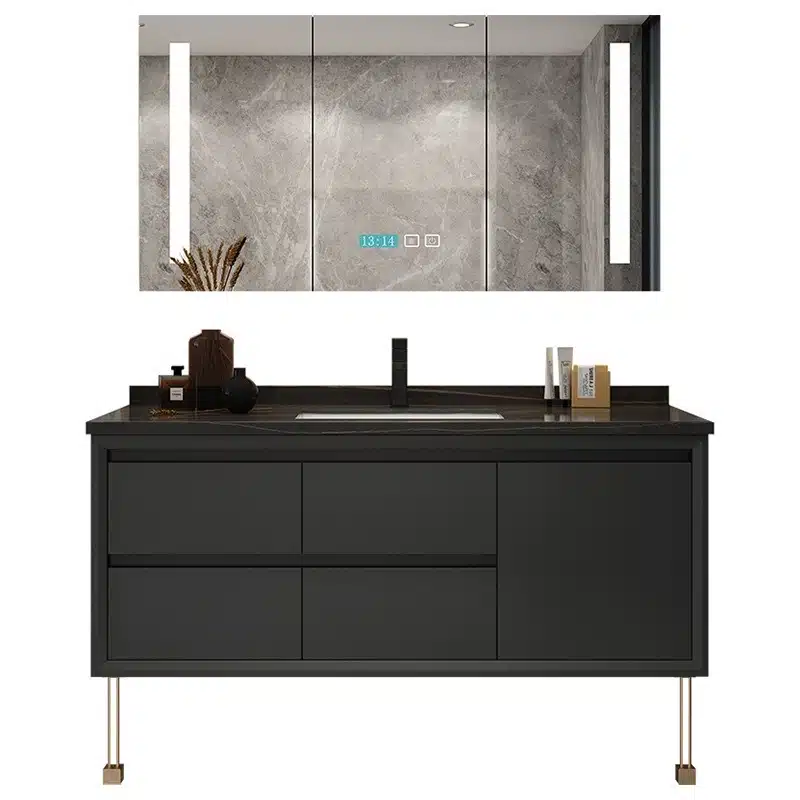
The market for bathroom fixtures has split into two dominant camps: matte black and brushed gold. Each finish serves a distinct design purpose and appeals to different segments of the residential and hospitality markets. Understanding the practical differences in aesthetic, maintenance, and durability is critical for making the right specification for your project.
Matte Black: The Modern, Low-Maintenance Choice
Matte black fixtures are the definitive choice for modern, minimalist, and industrial bathroom designs. Their non-reflective surface provides a strong visual contrast, especially in light-colored or neutral bathrooms, where they act as a bold design anchor. The primary functional advantage is their resistance to smudges, fingerprints, and water spots, which simplifies cleaning and keeps the hardware looking clean with minimal effort.
| Feature | Matte Black | Brushed Gold |
|---|---|---|
| Primary Aesthetic | Modern, Minimalist, Industrial | Luxury, Warm, Sophisticated |
| Maintenance Profile | Resists fingerprints and water spots | Hides spots better than polished metals |
| Durability (PVD Coated) | High resistance to scratches & corrosion | High resistance to tarnish & corrosion |
| Best Material Pairing | Concrete, stark whites, light woods | Natural stone (marble), dark woods, deep colors |
Brushed Gold: The Standard for Warmth and Luxury
Brushed gold delivers sophisticated elegance and warmth, establishing a luxurious atmosphere in high-end residential and hospitality projects. Unlike harsh polished metals, its soft, warm glow complements natural materials like marble, stone, and wood. This finish serves as a timeless accent that elevates the entire design, making the space feel more curated and expensive.
Durability and Mixed-Finish Strategies
You don’t have to choose just one. A popular and effective strategy is to mix both matte black and brushed gold to create a layered, high-contrast look. For example, using a matte black faucet with brushed gold cabinet pulls can add visual depth. Advances in PVD (physical vapor deposition) coating technology have made both finishes far more durable. This process improves scratch and corrosion resistance, ensuring longevity even in humid bathroom environments. Fixtures are now treated as strategic design elements rather than uniform components, giving designers more flexibility.
How to Avoid “Orange Peel”?
Achieving a flawless, glass-like finish on a bathroom vanity isn’t a single trick; it’s the result of a disciplined manufacturing process that controls surface preparation, application environment, and material science from start to finish.
“Orange peel” is the textured, bumpy surface that plagues low-quality paint jobs. It’s a common defect that signals rushed work or a lack of process control. For B2B buyers, specifying a vanity with a smooth, high-gloss finish is a non-negotiable quality standard. Avoiding this defect requires a systematic approach that addresses every stage of production, from the raw board to the final cure.
Proper Surface Preparation
The foundation for a perfect finish is a perfectly prepared surface. Any minor imperfection in the base material will be amplified by a glossy paint coat. We use high-precision CNC machines to ensure all PVC, plywood, or HMR MDF panels are perfectly flat and uniform from the start. Each component is then sanded to a fine grit, creating the ideal texture for primer adhesion. A high-quality primer seals the material, which guarantees the final lacquer coat absorbs evenly and doesn’t sink into the substrate, a common cause of surface texturing.
| Factor | Standard Workshop Finishing | FocusCabinet Industrial Finishing |
|---|---|---|
| Surface Preparation | Manual sanding; potential for inconsistencies and surface flaws. | CNC-machined base materials; automated fine-grit sanding for perfect uniformity. |
| Application Method | Manual spray gun; risk of uneven coating thickness and rapid drying. | Automated spray lines in a climate-controlled environment for consistent thickness and optimal leveling. |
| Curing Process | Air-dried in an open environment; susceptible to dust, humidity, and temperature shifts. | Cured in a controlled chamber with monitored temperature and airflow to ensure a hard, flawless surface. |
Controlled Application and Environment
Orange peel often happens when paint dries too quickly or is applied inconsistently. Our factory uses automated spray lines inside a climate-controlled and dust-free facility. This level of control allows us to regulate temperature and humidity, giving the paint sufficient time to level out into a smooth, glass-like surface before it begins to cure. Automated systems apply a consistent coating thickness across every part, eliminating the variations that cause texturing. We also manage airflow to remove airborne particles that can mar the finish, and we monitor curing times and temperatures to achieve optimal hardness and visual clarity.
High-Quality Finishing Materials
The paint formulation itself is the final critical factor. We use premium lacquers and paints engineered specifically for professional spray applications. These materials have the correct viscosity and flow characteristics to resist texturing naturally. We test and adjust paint viscosity to match our application equipment and the specific environmental conditions of the day. All materials are selected for their durability and resistance to humidity—a crucial requirement for vanities in markets like Southeast Asia and the Middle East. This ensures the finish not only looks perfect but also performs over the long term, meeting standards like low-formaldehyde E1 for our European partners.
How to Match Tile to Bold Colors?
Successful bold tile integration relies on strategic balance, using the 80/20 rule to anchor vibrant accents within neutral fields and layering mixed textures for depth.
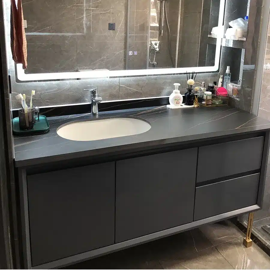
When working with a powerful color like navy blue, emerald green, or even a bold terracotta, the goal isn’t to saturate the room but to create a deliberate focal point. The wrong balance makes a bathroom feel small and chaotic, while the right approach creates a space that feels custom, intentional, and high-end. The key is to let the bold tile be the hero, supported by a cast of neutral materials that enhance its impact without competing for attention.
Use the 80/20 Rule for Balance
To avoid overwhelming the space, dedicate about 80% of the bathroom to neutral tones and use the remaining 20% for the bold accent color. This design principle ensures the vibrant tile makes a statement without causing visual fatigue. The neutral majority—walls, floors, and primary fixtures—creates a calm backdrop, allowing the accent color to draw the eye exactly where you want it.
- Select a single feature wall, shower niche, or vanity backsplash as the designated area for your bold color.
- Pair deep jewel tones or strong geometric patterns with simple, minimalist fixtures to let the color be the main focus.
| Accent Area (The 20%) | Neutral Field (The 80%) | Recommended Application |
|---|---|---|
| Navy Blue Glossy Zellige Tile | Large-Format Matte White Porcelain | Shower wall or vanity backsplash for a high-impact, luxurious focal point. |
| Black & White Geometric Cement Tile | Light Gray Concrete-Look Floor Tile | Bathroom floor to ground the space and add visual interest without overwhelming walls. |
| Forest Green Kit Kat Mosaic | Warm Beige or Creamy Travertine Tile | Vertical accent strip in the shower or a feature wall behind a freestanding tub. |
Incorporate Different Textures and Finishes
Mixing textures adds depth and prevents bold colors from appearing flat or one-dimensional. Combining different finishes, like matte and glossy, creates a layered, sophisticated design that feels expensive and well-planned. This tactic works by creating subtle variations in how light reflects off different surfaces, adding visual interest that pure color cannot achieve alone.
- Pair a glossy, colorful tile on an accent wall with a large-format matte neutral tile on the floor to ground the space.
- Use metallic fixtures—like brushed gold or matte black—that complement the tile’s finish to tie the entire look together.
Conclusion
Moving beyond the all-white bathroom creates new market opportunities. Colors like navy blue, emerald green, and sage green offer timeless appeal or spa-like tranquility that attracts a wider range of buyers. Executing these designs with the right hardware, flawless finishes, and smart tile pairings is key to delivering a premium final product.
If you are ready to expand your catalog, consider how these colors can enhance your next collection. Contact our team to discuss custom material specifications or order a refundable sample to test our quality firsthand.
Frequently Asked Questions
Most popular bathroom vanity color 2026?
In 2026, the most popular vanity colors are warm whites and natural wood tones. Warm whites align with the dominant trend of bright, spa-like bathrooms but add a softer, more inviting feel than stark clinical whites. Natural wood finishes, like light oak and rich walnut, are also extremely popular, providing texture and an organic element that contrasts beautifully in an otherwise neutral space.
What color hardware for blue vanity?
For a blue vanity, the ideal hardware color is champagne bronze or brushed gold. This warm metallic finish creates a striking, luxurious contrast against both navy and lighter blue tones. For a more modern or industrial look, matte black is an excellent choice. For a classic, timeless aesthetic, brushed nickel or polished chrome remain safe and stylish options.
Is green vanity trendy?
Yes, a green vanity is very trendy. Earthy green tones, particularly sage green, olive, and deeper forest greens, are highly sought after. This trend is driven by a desire for nature-inspired, biophilic design in the home. A green vanity acts as a sophisticated statement piece that adds color while maintaining a calming, organic feel in the bathroom.
Sage green vs emerald green vanity?
The choice depends on your design goal. A sage green vanity creates a soft, serene, and earthy atmosphere, ideal for spa-like and modern farmhouse aesthetics. It’s versatile and pairs well with black, chrome, or nickel hardware. An emerald green vanity is bolder and more dramatic, lending a touch of luxury and art deco glamour. It pairs exceptionally well with brass or gold hardware to create a high-end, jewel-box effect.
Best wall color for blue vanity?
The best and most versatile wall color for a blue vanity is a crisp, warm white. This creates a clean, high-contrast look that makes the vanity the focal point of the room. A very light, soft gray is another excellent option for a more subtle, layered look. Avoid cool or stark whites, as a warmer tone will make the space feel more inviting and sophisticated.
Does blue vanity lower resale value?
No, a blue vanity generally does not lower resale value and can often enhance it. Classic shades like navy blue or muted slate blue are considered sophisticated and timeless design choices. They add a custom, high-end feel to a bathroom that appeals to many buyers. While an overly bright or niche shade of blue could be polarizing, a tastefully chosen blue is a safe and valuable design investment.

0 Comments