
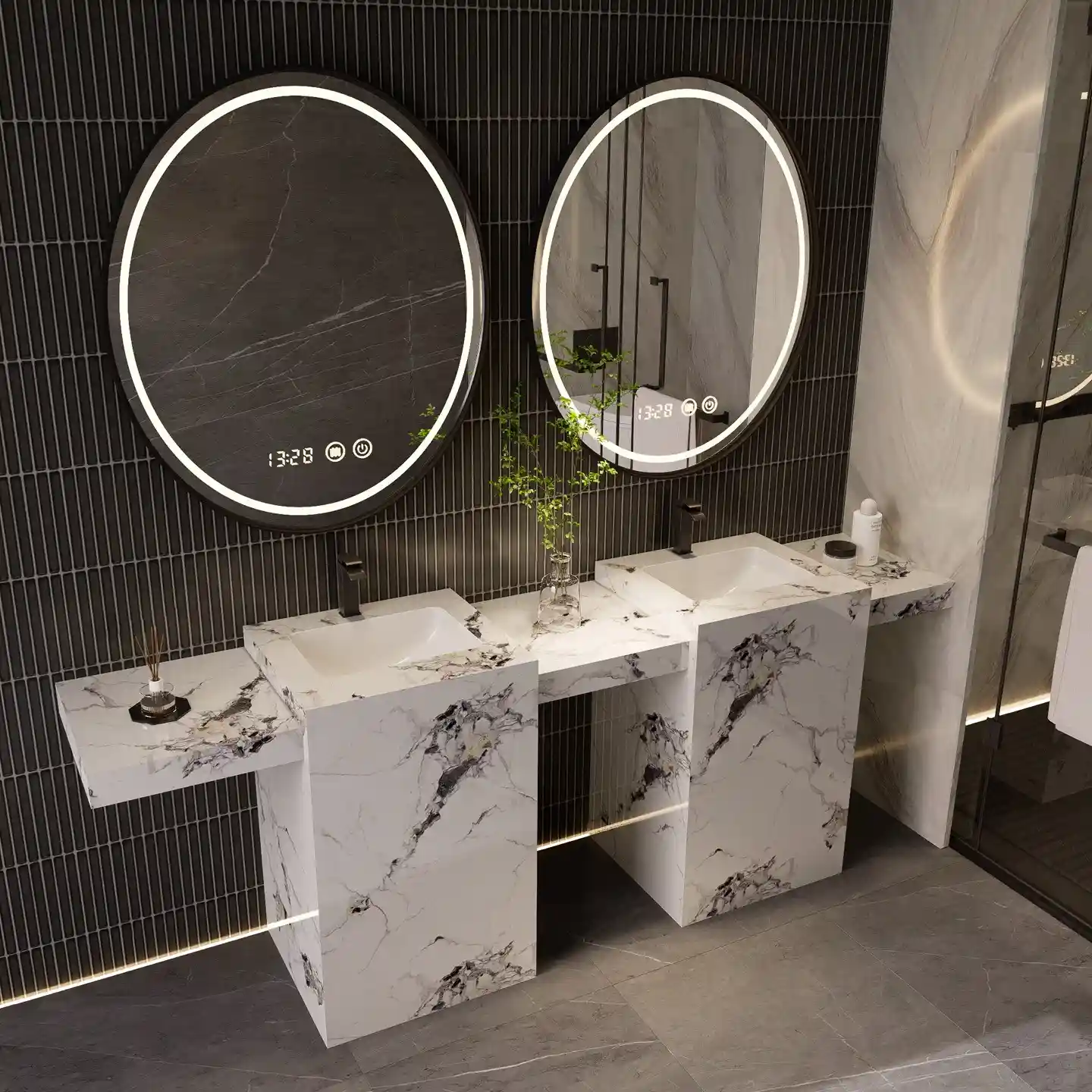
Choosing colors for your next vanity container is an inventory decision, not a decorating exercise. Every finish you order becomes a stock keeping unit (SKU) that occupies warehouse space until it sells, and a color that misses leaves as discounted stock. This guide turns the bathroom vanity color trends 2027 conversation into a distributor stocking plan: what to order deep, what to trial, and what to skip, with the factory mechanics that make small color tests practical from Main Focus Cabinet (MFBATH).
Trend reports are written for designers choosing one project at a time, while you commit to dozens of cabinets per color against demand you cannot fully predict. So the logic here is different: warm neutrals carry the volume, statement colors earn small test batches, dark finishes keep serving commercial work, and two-tone wood pairings stretch the lineup you already carry. MFBATH, founded in 2015 in Changge, Henan, with 95 employees and a 10,000-square-meter plant, runs a minimum order quantity (MOQ) of 15 sets per model, color, and size, supports mixed-container loading, and turns free samples around in 10 working days.
Key Takeaways
- Treat each color as a stocking bet with a review date: deep orders for proven base colors, small trials for new ones, and a phase-out plan for the rest.
- Warm neutrals such as greige, sand, and soft white are the strongest base-stock direction in current signals because they tolerate the widest range of tops and hardware.
- Statement colors such as sage, misty blue, terracotta, and blush pink belong in 15-set trials with samples approved first, not container commitments.
- Black, espresso, and charcoal keep steady commercial demand; match the finish and hardware to hard water and high turnover.
- Two-tone and wood pairings extend a color line without new colors, and mixed-container loading keeps trial freight efficient.
Table of Contents
- Color Is a Stocking Decision, Not a Decor Opinion
- The Warm Neutral Shift: Greige, Sand, and Soft White
- Statement Colors Worth a Trial SKU: Sage, Blue, and Terracotta
- Dark and Moody: Black, Espresso, and Charcoal Keep Selling
- Two-Tone and Wood Pairings That Extend a Color Line
- What to Skip in 2027 and How to Phase Old Stock
- Frequently Asked Questions
- The Bottom Line
Color Is a Stocking Decision, Not a Decor Opinion
Walk any distributor warehouse and you can read last year’s color bets in the discount aisle. That is the real cost of a color decision: not the finish itself, but the weeks a slow shade spends on your floor and the discount that finally moves it. Contractors buy colors they can resell quickly to homeowners; a proven neutral moves the same week, while a bold shade waits for exactly the right project. Before you order, define what each color must do: carry volume, differentiate your lineup, or serve a named commercial job. A color ordered without an assigned job is a color that will eventually be discounted.
Signal reading matters, but it needs a method. This read of bathroom vanity color trends 2027 is a synthesis of what design media, trade-show floors, and color-system publishers have shown through 2026: warm neutrals replacing cool gray, grounded earthy statement colors, and deep darks holding their place. The annual color-of-the-year announcements from color systems such as Pantone are worth following as evidence of where the conversation is heading, not as purchase orders; no announcement predicts what sells in your city. Watch them, watch what your contractor customers actually request, and adjudicate the debate with your own order book.
The core discipline is a split: most of your color depth sits in finishes with proven turnover, and a small, deliberate slice tests what could become the next base. Factories built their ordering rules around exactly this logic. MFBATH’s MOQ of 15 sets per model, color, and size means a trial color costs the same minimum as a safe color, which is the point: the minimum is low enough that you can afford to be wrong, and mixed-container loading lets a test color ride along with your base colors instead of demanding a container of its own. Your job is to decide which slice is the experiment and to name the date it gets judged.
Judge a candidate color with three tests before it earns warehouse space. First, composition: does it photograph well and pair with the stone tops and hardware you already stock, because a vanity sells as a whole look, not as a color chip. Second, timing: is this color early, current, or late in its cycle, because ordering at the peak of a trend usually means selling at the bottom of it. Third, recovery: if it stalls, can you move it as a special-order sample, a remodel accent, or a paired display, or will it sit alone? Colors that fail these tests belong in the skip column even when they look beautiful in a showroom photo.
The Warm Neutral Shift: Greige, Sand, and Soft White
The clearest signal in recent showrooms and design media is the retreat of cool gray in favor of warm neutrals: greige, sand, soft white, and warm off-whites, often paired with light oak and beige-toned stone. Hardware follows the same shift, with brushed brass appearing next to warm cabinets where polished chrome once dominated. Treat it as a direction to watch and validate in your own market rather than a verdict: warm neutrals flatter what they surround, soften bathroom light, and age less visibly than cool tones. For the wider pattern, our bathroom vanity style and trend guides track the same signals across finishes, mirrors, and layouts.
Warm neutrals earn the deepest cuts in your plan because they tolerate everything around them. A greige or sand cabinet works with white quartz, cream marble-look tops, beige travertine, and warm wood, so the cabinet never constrains the stone you sell beside it; soft white accepts brushed nickel, brass, or matte black without fighting any of them. One cabinet color can therefore support many tops instead of forcing you to stock a matching stone for every finish, and it smooths exchanges, since a customer who swaps a countertop keeps the same cabinet.
There is a useful distinction inside the white family. Stark bright white reads clinical in bathroom photography, while soft white, ivory, and sand-toned whites photograph warm and pair cleanly with both white and wood tops. Put the volume behind greige and soft white across the widest size run: standard vanity widths at MFBATH span 24-60 in with depths of 18-24 in, so one finish family can cover most of your model matrix. Keep sand as the secondary tone that gives contractors a visible alternative to gray.
Do not skip physical samples with neutrals, because whites and greiges shift between a photo, a monitor, and a cabinet door under bathroom LED light. Order free samples of the two or three tones you are choosing between (10 working days at MFBATH), lay them against the stone chips and hardware you actually sell, then commit the depth. Check the finish system in the same pass, because a neutral sold in volume must hold up in wet rooms for years: solid-wood options carry multi-layer polyurethane waterproof coatings, and plywood models add waterproof edge banding at the seams.
Statement Colors Worth a Trial SKU: Sage, Blue, and Terracotta
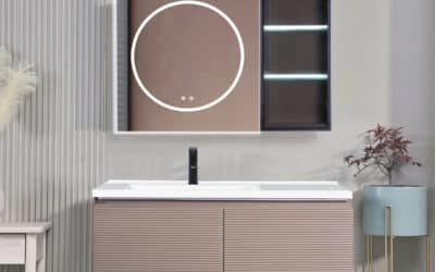
Every color line needs a reason for a buyer to choose you over the big-box alternative, and statement colors are that reason. Through 2026, design media and showroom floors have been pushing colors drawn from nature rather than from the cool gray palette: sage and muted greens, misty blue, terracotta and clay tones, and soft blush pinks on curved and ribbed silhouettes. None of these is a prediction worth betting a container on; each is a candidate worth testing in small batches while the signal is fresh. The vanity below shows the format doing well in that conversation: a soft pink body with ribbed panels reads clearly in showroom and listing photos.
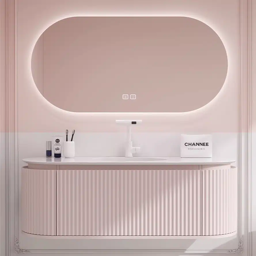
The ordering structure exists precisely so a trial costs you little. MFBATH’s MOQ of 15 sets per model, color, and size means a sage test is 15 cabinets, not a container; samples turn around in 10 working days with free sample support; and mixed-container loading lets the trial color travel with base colors, keeping freight economics intact. Before you place the order, write down the success bar: how many of those 15 sets need to sell, and in what window, before you reorder the color at depth. A trial without a review date is just an inventory accident waiting to happen.
Each statement color sells fastest when the listing and the showroom present it as a complete composition. Sage green reads cleanest with warm white tops and brushed brass or matte black hardware; misty blue works with white quartz and brushed nickel; terracotta pairs with light oak and dark fixtures; blush pink lands with white marble-look tops and gold or nickel accents. Photograph every trial color as a finished set, because the contractor who orders a statement vanity is buying the whole look, not a color swatch. To extend into deeper families, our navy, emerald, and sage palette guide covers which deep tones pair with which stones and hardware.
Before you commit, verify the factory can reproduce the color consistently across production runs, which is where custom manufacturing capability shows up. MFBATH supports 40,000+ custom combinations covering Pantone-based color matching, materials, basin types, and hardware, so the shade you approve in June should match the cabinets that load in December; for a closer look at the process behind colored cabinets, see how blue, green, and black vanities are manufactured. A matching countertop widens the offer further: the factory’s sintered stone basin program, which already serves 500+ dealers, produces nonporous, stain-resistant tops in multiple textures.
Dark and Moody: Black, Espresso, and Charcoal Keep Selling
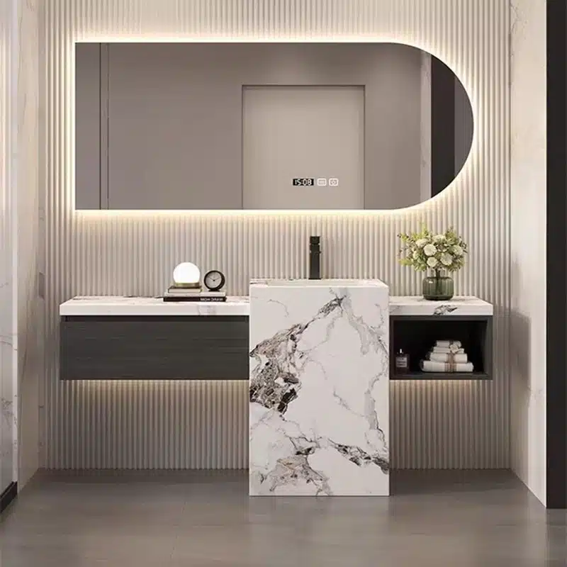
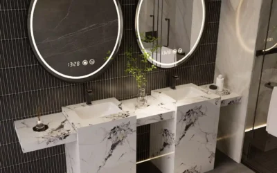
Dark cabinets have a different buyer than trend colors: commercial and multi-family specifiers who need a finish that reads intentional and photographs well in lobbies, hotel baths, and apartment listings. Matte black, espresso, and charcoal have kept a stable place in that channel through recent cycles, and current showroom signals suggest they stay, not as a headline trend but as steady specifying-grade volume. The unit below shows the format that keeps working: a dark double-sink body, light stone at the center, and textured wall treatment around it.
For a distributor, the useful work is matching the finish to the abuse it will take. Matte black and matte charcoal hide fingerprints far better than any gloss, which matters in high-turnover rental and hotel bathrooms; high-gloss darks show every smudge and demand constant upkeep. The tradeoff runs the other way on water: hard-water spots and mineral deposits stay visible on dark colors regardless of sheen, so in hard-water markets the property needs a wiping routine or a soft-water system, and you should say so in your product notes. Ask the factory how its coating system is tested, because a commercial repeat order lives or dies on that answer.
Dark cabinets also sell better as part of a two-surface composition, which is convenient because it lets you pair them with the light tops you already stock. Black and espresso bodies under white or cream tops are the commercial standard; charcoal works with warm oak and walnut tones; and a sintered stone top in a marble texture upgrades the order without adding a cabinet SKU. Hardware carries the rest of the look: matte black and brushed nickel dominate, with brass reserved for hospitality settings. On the factory side, solid wood at MFBATH carries multi-layer polyurethane waterproof coatings, and every cabinet passes a five-point inspection before packing.
Because dark demand spreads across tiers, you can consolidate it at one factory: PVC models in black and espresso, plywood cabinets in charcoal, and solid wood in walnut and dark-stained oak, all under one MOQ and warranty structure. MFBATH’s two-year whole-cabinet warranty covers full-container orders, which matters when the same finish is specified across an entire building. For the full matrix of materials, sizes, and finish families you can line up from a single supplier, see the full bathroom vanity product range.
Stock 2027-Ready Colors With Custom-Line Flexibility
Browse this product, solution, or service page to explore relevant offerings.
Two-Tone and Wood Pairings That Extend a Color Line
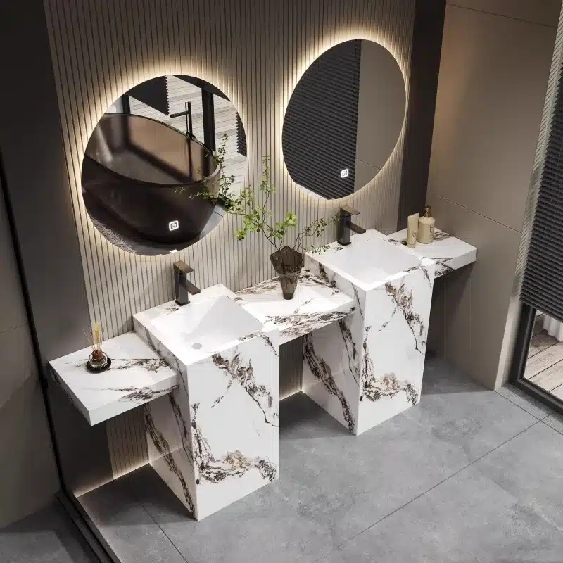
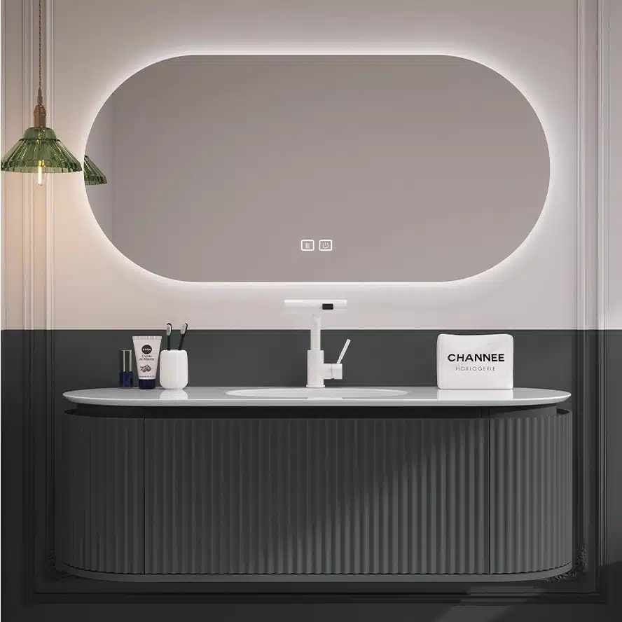
To widen a color story without multiplying slow-moving SKUs, the practical answer is two-tone construction: one cabinet carrying two finishes reads as a new product while using colors already in your program. Classic combinations are dark bases under light uppers, painted bodies with wood drawer fronts, and wood bases topped by a contrasting painted cabinet. The pairing below shows the other half of the trick: a gray double-sink body against a green and white tiled wall, proving that cabinet color works in dialogue with the surfaces around it.
Wood finishes give two-tone programs their texture, and the direction in current signals is warmer, more visible grain: oak leading in light and mid tones, walnut for contrast, maple and ash in support. Solid-wood vanities at MFBATH use oak, walnut, maple, or ash with multi-layer polyurethane waterproof coatings across 20 standard finishes, and FSC-certified wood is available on request for buyers whose project contracts reference FSC forest certification. For the deeper read on how wood tones are moving and which grain treatments pair with which color bodies, our 2027 wood finish trends for vanities covers the direction in detail.
Hardware is the multiplier on a two-tone program: the same greige body with a wood drawer front changes character with brushed nickel, matte black, or warm brass pulls, and MFBATH’s custom options include brand hardware plus logo printing and laser engraving, so a distributor can mount its own pulls and finish the package locally. Two-tone also extends into accessories: smart LED mirrors with adjustable brightness, color temperature, anti-fog, touch control, and clock display, from 24×36 to 48×72 in, give contractors a matched set to specify above the vanity and give you a second line item on the same order.
Order two-tone lines with the same discipline as colors, since each finish counts toward its own minimum: confirm how the model is counted before you add SKUs, and use mixed-container loading to combine painted and wood-tone bodies in one shipment. Done that way, two-tone becomes a growth lever you pay for once and recover across many reorders.
What to Skip in 2027 and How to Phase Old Stock
Knowing what not to deepen is half of a clean warehouse. Based on the direction of current signals, the finishes to treat cautiously as 2027 base stock are cool gray used as a full-room scheme, which keeps losing ground to warm neutrals; stark bright white across large surfaces, which now reads clinical next to soft white; and high-gloss solid colors on large cabinet runs, which show upkeep and photograph hard. These are not dead colors, and commercial maintenance orders can keep them alive for years, but the signal is weakening, and that makes them candidates for consolidation rather than expansion. The table below summarizes the stocking move for each.
| Finish Family | What Current Signals Say | Stocking Move |
|---|---|---|
| Cool gray as a full-room scheme | Warm neutrals keep taking its place in showrooms and design media | Fill only committed contracts; do not reorder on speculation |
| Stark bright white at scale | Reads clinical next to soft white and warm stone | Shift volume to soft white and ivory in the same size matrix |
| High-gloss solid colors on large cabinets | Smudges and reflections dominate the look and the photos | Keep for accent pieces; put volume in matte or satin finishes |
Old stock clears fastest when it stops looking like old stock. Bundle a dated color with a fast base color as a matched set at a bundled price, so the discount reads as a deal on the set rather than a clearance on the color; pair old tones with new arrivals in the showroom and in catalog photos, where a warm-toned older cabinet suddenly looks intentional next to greige and oak; and run volume-based tiered discounts for contractors who take a remaining run into one project. Avoid dumping the entire lot at a single markdown, because the channel remembers the price level you set.
The cleaner long-term habit is ordering so that phase-out never becomes an event. Keep base colors at reorder depth, test one or two statement colors per season at the 15-set minimum, and retire the slowest-moving color each cycle so the assortment does not quietly accumulate. When a new color joins the line, the old one should already have an exit plan: a few units offered as samples for contractor special-order projects, one set for the showroom, and the balance worked through promotions across the season.
Finally, write the trial terms with your supplier before the first purchase order, not after. Confirm that the MOQ applies per model, color, and size; confirm that mixed-container loading is available so trial colors share freight with base colors; confirm the production window (20-30 days at MFBATH after sample approval) and the total delivery time to your market; and put the warranty in writing, since a two-year whole-cabinet warranty is only useful when it is on the contract you signed.
Frequently Asked Questions
Which base color should most of my 2027 order commit to?
Put the depth behind warm neutrals: greige, sand, and soft white. They pair with the widest range of stone tops and hardware, photograph warm instead of clinical, and tolerate color drift across production runs better than cool gray. Stock greige and soft white across the full width matrix (24-60 in at MFBATH) and keep sand as the secondary tone contractors can choose instead of gray.
How do I test a new statement color without tying up working capital?
Order samples first, with free sample support and a 10-working-day turnaround, then buy the trial at the MOQ of 15 sets per model, color, and size. Load the trial color into a mixed container with your base colors so freight stays efficient, set a review date in writing, and reorder at depth only if the batch sells within your target window. The two-year whole-cabinet warranty on full-container orders covers the production-risk side of the trial.
What should I watch when selling dark vanities into commercial projects?
Match the sheen to the use: matte black and charcoal hide fingerprints, while gloss darks demand constant upkeep in high-turnover bathrooms. Expect hard-water spots to stay visible on dark colors in any sheen, so advise properties with hard water on wiping routines or a soft-water system. Confirm the coating system for real wood (multi-layer polyurethane waterproof coating at MFBATH), pair dark bodies with light tops, and spec matte black or brushed nickel hardware.
How do I phase out old color stock without killing my margin?
Sell old colors inside bundles with fast base colors so the discount reads as a deal on the set, display them beside new arrivals so they look curated rather than dated, and move larger remaining runs through volume-based tiered discounts to contractors with named projects. Reserve a few units for samples and the showroom, and let the balance work through the season at planned steps instead of one deep markdown.
The Bottom Line
Build the 2027 order like a portfolio: warm neutrals carry the depth, statement colors arrive in 15-set trials with a written review date, dark finishes keep serving commercial volume, and two-tone wood pairings extend the story without adding colors. Let samples and mixed-container shipments test the market before you commit container space, and phase out the weakest color every cycle instead of letting stock age into one large markdown. Treat design media and showroom signals as direction rather than orders, and give the next order to a factory whose minimums, sample turnaround, and warranty make adjusting cheap.

0 Comments